The Importance of Color in Simple Décor: Choosing Palettes that Inspire Tranquility
The Role of Color in Interior Design
Color plays a pivotal role in shaping our moods and experiences. In the realm of simple décor, choosing the right color palette can create an atmosphere that fosters tranquility and enhances our well-being. Many homeowners are unaware of the profound influence that hues can have, transforming a space from chaotic to serene. The impact of colors extends beyond mere aesthetics; they can affect our emotions, behavior, and even productivity levels.
Consider these aspects of color psychology:
- Blue promotes calmness and is often associated with tranquility. Research suggests that blue environments can lead to lower blood pressure and heart rates, creating a soothing atmosphere ideal for bedrooms or quiet spaces.
- Green embodies nature and balance, evoking feelings of relaxation. Studies have shown that exposure to green spaces can reduce stress and mental fatigue, making it a perfect choice for home offices or meditation rooms.
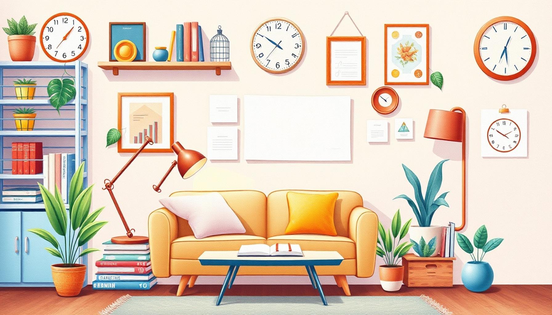
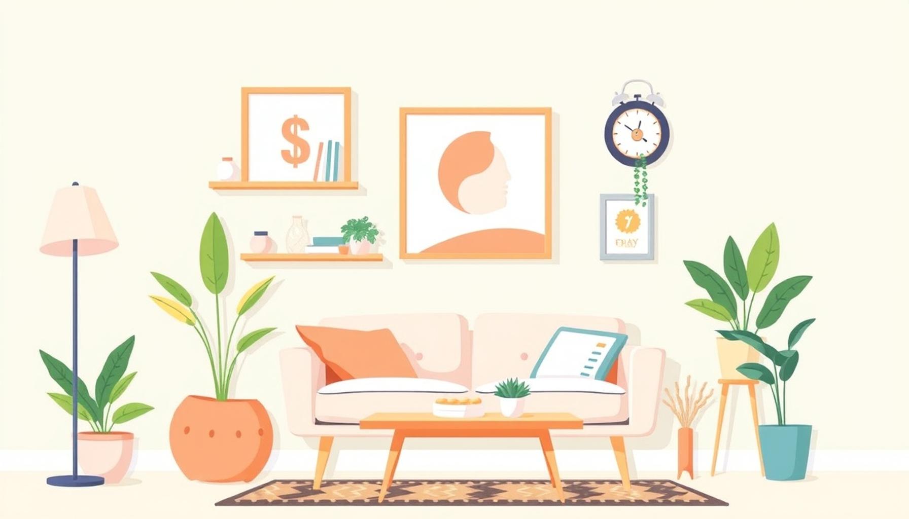
- Soft neutrals create a peaceful backdrop that allows other colors to shine. Shades like beige, cream, and soft gray provide a calming foundation that encourages a sense of openness and serenity, ideal for any living space.
In the United States, a notable shift towards minimalist designs is making color selection even more significant. As homes become simpler and clutter-free, the colors we choose need to work harder, enhancing the ambiance without overwhelming the senses. A thoughtfully curated palette can turn any room into a sanctuary. For instance, pairing pale blues with soft whites can reflect light beautifully, making a small space feel spacious and inviting.
Moreover, consider the psychological effects of accent colors when designing interiors. A strategically placed vibrant yellow accent wall in a kitchen can promote cheerfulness and stimulate appetite, while a cool lavender in a bathroom can create a spa-like experience. Each color you choose sends a message, influencing not only how you feel but also how others perceive your space.
Throughout this article, we will explore how to choose color palettes that inspire tranquility. We’ll share tips and examples that resonate with the American aesthetic while diving deep into the psychology behind each color choice. You’ll learn how to incorporate various shades mindfully, fostering an environment that promotes peace and mindfulness. Discover how the right colors can truly transform your living space into a retreat for both relaxation and reflection.
Understanding the Emotional Impact of Color
When it comes to interior design, the choice of colors can serve as a powerful tool that transcends mere visual appeal. The emotional impact of color is an essential consideration in crafting spaces that promote tranquility and well-being. Just as scents can evoke memories, colors can elicit specific feelings and responses within us. By understanding how different shades interact with our psyche, homeowners can create environments that foster a sense of peace and relaxation.
To fully harness the potential of color in simple décor, it is crucial to delve into the characteristics of various hues. Below are some colors that are particularly effective in creating serene spaces:
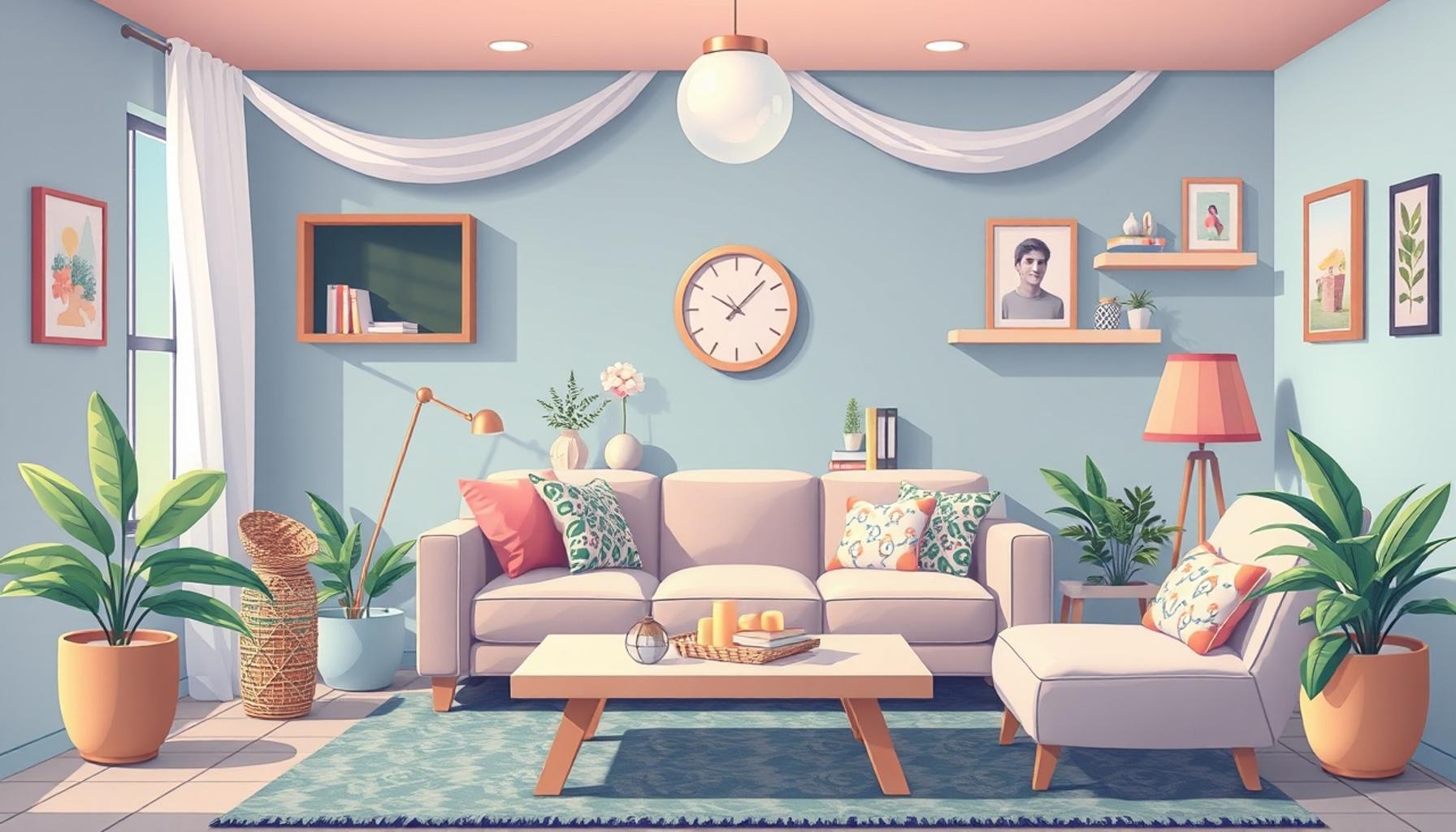
- Pale Blue: Often linked to the sky and water, pale blue shades can create an open, airy feel while also invoking a sense of calm. Utilizing pale blue in bedrooms promotes restfulness and tranquility, making it an ideal choice for your sanctuary.
- Soft Greens: Associated with renewal and balance, soft greens replicate the gentle influence of nature, helping to dispel stress and mental exhaustion. This color works well in areas where relaxation occurs, such as reading nooks and meditation corners.
- Warm Neutrals: Colors like taupe, beige, and warm gray serve as a soothing foundation that can blend seamlessly with other colors. These hues provide a balanced backdrop that encourages harmony within any room, reducing visual noise and promoting relaxation.
- Warm Earth Tones: Shades of brown, rust, and terracotta bring warmth and comfort, reminiscent of nature and organic materials. These hues ground a space, making it feel more inviting and cozy, perfect for living areas where family gathers.
As the trend towards minimalist design gains traction in the United States, the importance of selecting harmonious color palettes cannot be overstated. In uncluttered settings, the chosen colors must perform dual roles: enhancing aesthetics while simultaneously promoting feelings of tranquility. For example, a combination of muted greens and earthy browns can instill a sense of balance and instant calmness, a transformative quality in an open-concept home.
Furthermore, the notion of accent colors should not be overlooked. Subtle enhancements, such as a carefully placed deep teal or coral artwork, can inject energy into an otherwise calm palette without overwhelming it. The key is harmony—finding the right blend that allows every hue to support the tranquil atmosphere you’re aiming to create. Utilize accents sparingly to prevent visual clutter, ensuring they remain harmonious with your primary color choices.
In the subsequent sections of this article, we will explore practical tips for selecting the perfect palettes and share inspiring examples that resonate with contemporary American design. With a deeper understanding of how color influences our emotions, you will be equipped to create a restorative environment that invites relaxation and reflection.
| Category | Description |
|---|---|
| Color Psychology | Colors can evoke specific emotions, influencing mood and ambiance. |
| Calming Palettes | Colors such as blue and green promote a sense of peace and tranquility. |
| Mood Elevation | Choosing harmonious colors can enhance overall well-being. |
| Personal Expression | Palettes reflect individual style and can create a unique atmosphere. |
Using color effectively in simple décor can be the foundation of a harmonious living space. Understanding color psychology is essential; specific tones have the power to alter our feelings and interactions within a room. For instance, soft blues and greens are well-known for fostering calm and serenity, establishing an environment that inspires tranquility. In choosing your palette, consider how each hue resonates with you and contributes to your emotional landscape.To achieve a truly tranquil setting, it is crucial to select a palette that encompasses balance. Incorporating accents in soothing colors alongside muted tones can elevate your mood and enhance the atmosphere of your home. This mood elevation is not merely an aesthetic consideration; it speaks to the essence of creating a nurturing environment for all who inhabit the space.Moreover, your color choices can serve as a personal expression of your unique style. By thoughtfully selecting hues that align with your personality and values, you not only beautify your surroundings but also cultivate a space that feels authentically yours. Thus, embarking on the journey of choosing the right color palette becomes an enriching experience that transcends mere decoration.
The Role of Lighting in Color Perception
In addition to the inherent qualities of color, lighting plays a critical role in how colors are perceived within a space. The interplay between light and color can significantly alter the atmosphere of a room, making it essential to consider both elements when aiming for a serene environment. Natural light, for instance, enhances the vibrancy of colors during the day, while artificial lighting can create different moods, depending on its intensity and hue.
Warm light, often found in incandescent bulbs, can amplify the richness of warm earth tones and neutrals, providing a cozy and inviting atmosphere. On the other hand, cooler light, such as fluorescent bulbs, can cause softer shades like pale blue and green to appear more sterile and less inviting. To achieve a tranquil ambiance, focusing on layered lighting—incorporating a mix of ambient, task, and accent lighting—can create depth and highlight your color choices effectively.
Moreover, the quality of light affects how colors interact with each other. For example, a soft green wall bathed in the golden light of sunset can evoke feelings of calm and safety, while the same green under harsh fluorescent lighting might appear jarring and unappealing. Thus, mixing natural and warm artificial lighting can help ensure that colors maintain their soothing effect regardless of the time of day.
Combining Textures and Patterns for a Tranquil Experience
While color alone can influence tranquility, the combination of various textures and patterns adds richness and complexity to a simple décor scheme. Incorporating soft linens, natural woods, and organic materials not only aligns with a minimalist approach but also enhances the overall sensory experience. Textures can soften the edges of a space, inviting touch and comfort without overwhelming the senses.
For instance, a pale blue wall paired with textured white curtains can add depth while ensuring the calmness prevails. Additionally, integrating subtle patterns—such as tone-on-tone stripes or delicate botanical prints—can create visual interest without detracting from serenity. It is crucial to select patterns that echo the chosen color palette. A muted floral design in soft greens and blues can beautifully accentuate the tranquil theme, serving as an anchor while keeping the ambiance peaceful.
- Choose Lightweight Fabrics: Opt for airy materials like cotton and linen that enhance natural light and maintain an uncluttered feel.
- Layer with Natural Elements: Use wood, stone, or jute to add warmth and create a connection to nature, further promoting relaxation.
- Limit Bold Patterns: While patterns can introduce excitement, it’s advisable to limit their use to one or two elements, ensuring they harmonize with the overall serene décor.
In an age where simplicity and sustainability are increasingly valued, seeking color palettes, textures, and lighting that promote tranquility can transform any environment. As you delve deeper into the influence of color in your home, remember that every choice you make contributes not only to the aesthetic vision but also to your emotional well-being. Engage with your space thoughtfully, leading to a simpler, more peaceful life.
Conclusion: Embracing Color for Tranquility in Décor
In conclusion, the significance of color in simple décor extends far beyond aesthetics; it is a key element that can profoundly influence our emotional state and overall well-being. By carefully selecting color palettes that resonate with tranquility—such as soft blues, gentle greens, and warm earth tones—you can create a serene sanctuary in your home that promotes relaxation and introspection.
Moreover, the integration of varied textures and subtle patterns enriches the sensory experience, providing depth and comfort while maintaining simplicity. Layered lighting techniques ensure your color choices shine at any time of day, enhancing your space’s atmosphere and fostering an inviting environment.
As you embark on the journey to redefine your space, consider the powerful impact these factors can have on your emotional landscape. Remember that every detail counts; from the light fixtures to the textiles you choose, each decision contributes to the harmonious whole. This meticulous attention to detail will not only elevate your interior design but also create a nurturing home environment that inspires tranquility.
Ultimately, embracing color thoughtfully in your décor encourages mindfulness and fosters a sense of belonging. Dive deeper into the world of calming hues and serene designs, and discover how intentionally curated spaces can lead to a more peaceful and fulfilling life.
Related posts:
Incorporating Natural Elements into Simple Decor: Sustainability and Minimalism
Creating Calming Environments: The Impact of Simple Décor on Mental Health
Simplicity Strategies: Practical Tips for Embracing Simple Décor in Your Home
The Art of Simplicity: How Minimalist Decor Can Transform Your Space
Organization and Aesthetics: Integrating Functionality into Simple Décor
The Influence of Simple Décor on Productivity: Creating Efficient Workspaces
Linda Carter is a writer and organization expert specializing in minimalism and personal organization. With extensive experience helping individuals create clutter-free, functional spaces and adopt mindful habits, Linda shares her knowledge on our platform. Her goal is to empower readers with practical advice and strategies to simplify their lives, stay organized, and achieve a sense of calm and balance in their daily routines.